In the world of entertainment, colour is everything. Yet, what we see under the flashing stage lights or on the silver screen is rarely a straightforward choice—often sparking intense production debates between artistic vision, technological limits, and history.
Take Dorothy’s iconic footwear. Ask most people what colour her slippers were in The Wizard of Oz, and they will immediately picture brilliant, glittery ruby. But pick up L. Frank Baum’s original 1900 novel, and you will find she actually wore silver shoes.
When Hollywood director Victor Fleming shot the 1939 film, he wanted to push the boundaries of the era’s groundbreaking Technicolor technology. The silver shoes looked dull and washed out against the bright yellow-brick road, so the studio famously swapped them for red. It was a triumph for cinema, but a total departure from the text—sparking a century of debate for costumers, historians, and set designers alike.


From sketchpad to Technicolor: W.W. Denslow’s original 1900 first-edition illustration (left) showcasing the book-accurate silver shoes, alongside the brilliant ruby red slippers from the iconic 1939 cinematic release (right). Notice how Hollywood kept a subtle design nod to the original book sketch by keeping the distinct decorative bows over the front of the shoes.
The Starlight Colour Erasure
These aesthetic shifts can create massive tension when classic stories are revived on stage. If you spent the last couple of years watching performers whizz around the custom-built Starlight Auditorium at the Troubadour Wembley Park Theatre, you already know how a single, vibrant palette can define a character.
For over three decades, Pearl the Observation Car in Andrew Lloyd Webber’s Starlight Express was defined globally by a very specific, ultra-feminine pink, white, and silver “glitter princess” aesthetic, topped with a massive, voluminous bubblegum-pink wig.

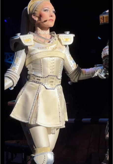

transformed into a streamlined, high-end “First Class”
luxury carriage look for the show’s 30th anniversary.
But when the creative team executed a radical overhaul for the show’s 30th anniversary, original designer John Napier did the unthinkable: he completely erased all traces of pink from Pearl’s palette. Swapping her signature hue for pale cream, heavy gold, and a slicked-back ponytail, the change fractured the traditional fanbase. While purists felt stripping her core colour ruined her identity, designers argued it was a necessary evolution to modernise her into a sleek, “First Class” luxury carriage.
Enter Colour Memory
When costume choices carry that much cultural weight, tracking design history becomes vital. Launched today, Colour Memory is a new independent colour intelligence platform designed to track the precise source, evidence, and evolution behind iconic shades. Built to plug directly into design tools like Figma and AI models like Claude, the platform houses 52,634 archive records spanning historical documents, materials, museum research, and cultural artefacts.
The platform was founded by Digby Oldridge, an Oxfordshire-based commercial photographer and filmmaker who has spent more than 20 years producing imagery for major brands and PR agencies.
“When anyone can make something look extraordinary with a single prompt, looking extraordinary is no longer enough. What matters is why,” says Oldridge. “Every colour has a past, and that history is an extraordinary creative resource. Colour Memory gives AI something more substantial to work from, so the decisions behind the work can be as interesting as the results.”
For theatre directors, film costumers, and brand builders, the tool acts as a historical safeguard. Instead of generating a generic, inaccurate hex code, the system grades the evidence. It can tell a designer exactly where a historical colour was verified, whether a hue is an interpreted “look-alike,” and even calculate whether a colour pairing passes modern accessibility standards before a single film set is built or a costume is sewn.
Anyone can test it. Six demonstrations, including a room-by-room reading of a 1771 country-house diary, each run in Claude with Colour Memory before publication, are at https://www.colourmemory.com/claude#ask, each starting “Using Colour Memory”, as the prompt.
Other Iconic Items That Changed From Text to Screen
Pearl’s pink palette and Dorothy’s slippers aren’t the only famous designs to undergo a dramatic visual shift during production. Creative teams routinely rewrite visual descriptions to suit the technical needs of the camera, lighting, or brand partnerships.
- Hermione Granger’s Yule Ball Gown (Harry Potter): In J.K. Rowling’s Harry Potter and the Goblet of Fire, Hermione arrives at the ball in robes made of a “periwinkle-blue material”. For the film, costume designer Jany Temime opted for a tiered pink gown. Because the Great Hall set relied heavily on deep blue, icy lighting, a blue dress would have caused Emma Watson to fade into the background. Pink ensured she popped as the focal point.
- James Bond’s Timepiece (Casino Royale): Ian Fleming was incredibly specific about 007’s watch in his books, noting that Bond wore a heavy, utilitarian Rolex Oyster Perpetual. Modern cinema entirely redirected the spy’s visual identity. Starting in 1995 and solidifying in the 2006 Casino Royale adaptation, Bond permanently switched to a sleek Omega Seamaster, transforming a literary detail into a massive commercial cinematic partnership.
- The Cat (The Hunger Games): In the books, Primrose Everdeen’s cat, Buttercup, is described as a scruffy, “muddy yellow” ginger tomcat that resembled a rotting squash. In the first film, filmmakers cast a black-and-white tuxedo cat. Fans of the books were so vocal about the visual inaccuracy that the director actually recast the animal for the sequel, replacing it with a screen-accurate orange ginger cat.


The Buttercup Debate: The original black-and-white tuxedo cat from The Hunger Games (left) compared to the book-accurate orange ginger tabby introduced in Catching Fire (right).
Whether it is a matter of changing theatrical tastes, lighting design, or commercial shifts, tracking the true history of a prop’s colour remains a vital piece of the creative puzzle – one that platforms like Colour Memory are finally mapping out digitally.


Add your thoughts...